How colors affect your Banner Design more than you think
Back then, when technology was not as developed as now, the only colors the banners had, were black and white. So, the design was limited by how much someone could do with only two colors. However, since the progress of technology, it was possible to include a whole rainbow of colors in any banner design. Nowadays, many people choose to advertise with color banners. And this election is because of their proven results. We cannot deny the impact of colors for the marketing industry, and even more the way our possible clients can act due to certain color elections. So, we want to show you how colors affect your Banner Design more than you think.
Do colors influence consumer behavior?
To begin with, it has been proven that the color you choose not only for your banner, but for your entire brand, can deeply affect the way people will respond towards it. It is extremely important to choose the right colors for your brand.
For example, if you open a company in Chicago that sells candies, you should not use yellow or green for any kind of promotional items. It is better to choose red, since it is a color that anyone can associate with sweetness. The type of color can trigger different responses into people.

Some researches have found that the color red can encourage people to buy more. Meanwhile, colors associated with blue tones, make people become more thoughtful and budget-conscious when deciding to buy something.
Banners and colors
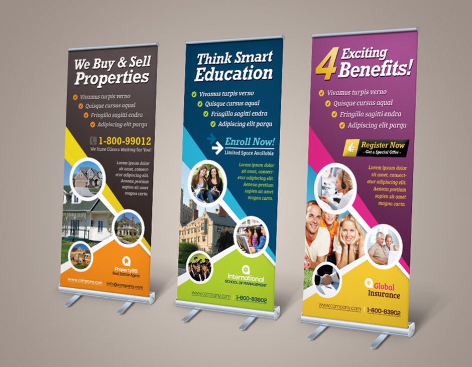
As a Banner Printing Chicago, we know that banners give your company a wide range of exposure, even more if placed outside. A banner can be used in any sort of events, like meetings, ferias, openings, conferences, and so on.
So, your company’s message will be exposed to many prospect clients. You expect to have a maximum exposure and to attract people’s eyes. But not only that. What you need to look is to transform those views into sales.
Keep in mind that some colors evoke different emotions in people. The color you choose needs to be in tone with your logo, your brand, your company’s identity, and the result you expect from the viewers.
For instance, let’s mention some colors that can help you gain attention from people. In case of color yellow, it is perfect to grabs people’s attention. So, if you want to first catch their attention, you’d better pick this color. But you have already grabbed their attention, now you want them to buy, not only see. For that, you can also use color orange. This will create a subconscious call-to-action. They will feel the need to buy. And not only that, but they can also associate it with affordability.
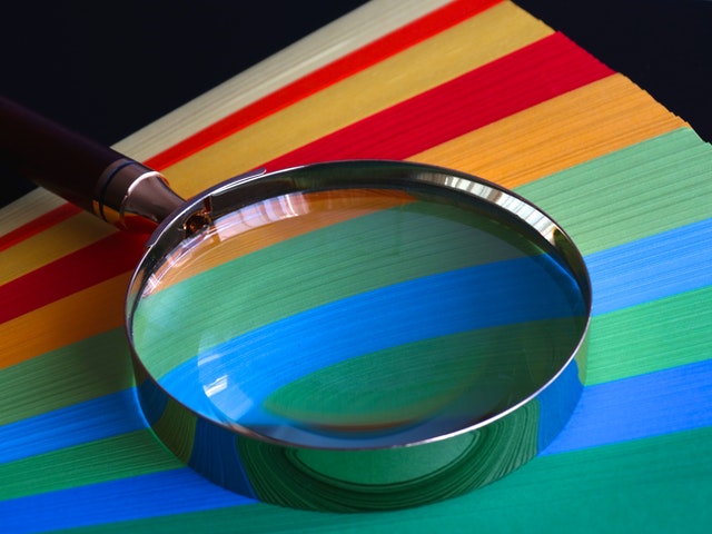
Color contrast in banners
Once you have chosen the color you will use for your banner, one that matches the whole company’s identity, it is also important to talk about contrasts. Online banner printing services recommend that in any type of advertisement, you need to consider certain things that stand out more than others. A contrast is used to emphasize important information you want people to notice. It is a great way to help consumers distinguish the different elements that appear on the banner. So, when you design and pick certain colors, you need to add color contrast for it to be a completely effective marketing tool.
Let’s take for example a banner advertisement you have designed whose main color is blue background. And you want to add a type of button to place the telephone number or any other important contact information. But you decide to give it a dark blue color. Will the people be able to notice it? No, it will be difficult for them to read it.
To fix that problem, you could decide to use a yellow or orange button. These two colors can create a deep color contrast. Besides, the users will be able to discern between elements, and find which one is the most important information.
On the other hand, you need to learn to moderate your color contrast and only pick the necessary ones. There might be situations in which you have understood the importance of color contrast. But you decide to use it in every part of your banner. Then, a person might get confused and overwhelmed about your banner. Learn to distribute well the colors. If it makes too difficult for you, the good online banner printing services can help you to choose the right colors and to know when to apply the perfect color contrast.
Think of your brand too
While it is important to sell, in order to increase revenues and your company’s budget, you also need to think in your brand and which industry you belong to. This has to do much more with the color of your logo. However, while designing your banner, that has to match with the type of logo you have, any good banner printing in Chicago will know which colors to use. For example, the colors green, blue and white represent trust and security, and can be used with companies that want to evoke a relaxed feeling.
So, the color you choose for your banner will for sure impact on your viewers. Depend on the type of response you want to get; you choose the colors. Of course, if still need help, you can ask any professional printing service. The best professionals are aware of the psychology behind colors, and will know which one to use.